See on Scoop.it - Website Designing
See on mobile.smashingmagazine.com
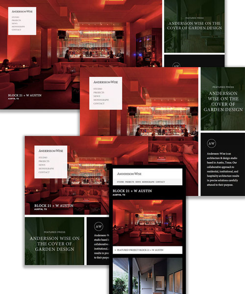
Chances are that your responsive websites have media query breakpoints at precisely the tablet and mobile widths, essentially creating three different versions of a website with the same code.
See on mobile.smashingmagazine.com


0 comments